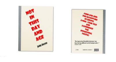
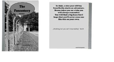
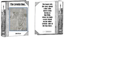
An Alternative Cover
Here you find our alternative covers:
cover-Meike (pdf, 289 KB)
Cover-Niko (pdf, 651 KB)
Cover-3 (pdf, 1,292 KB)
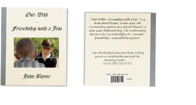
Out-With-Friendship-with-a-Jew (pdf, 286 KB)
Cover-6 (pdf, 324 KB)
cover-Meike (pdf, 289 KB)
Cover-Niko (pdf, 651 KB)
Cover-3 (pdf, 1,292 KB)
Out-With-Friendship-with-a-Jew (pdf, 286 KB)
Cover-6 (pdf, 324 KB)
heimunidue - 13. Feb, 17:51
anonymous (Gast) - 21. Feb, 09:26
Very creative! I like the different covers.
antworten
PA.KR+MA.PA (Gast) - 24. Feb, 12:13
We love the different covers. It is very creative.
I liked to work on it.It was very funny.
I liked the day in the university.
I liked to work on it.It was very funny.
I liked the day in the university.
M.B. (Gast) - 24. Feb, 12:15
I like those covers. They are very creative, but the pictures are from the film. That doesn´t fit, because, when you read the book, you already know how the caracters look like.
The first cover is very good, but you don´t konw what the book is about when youjust read the hading.
But it looks very nice and creative.
The first cover is very good, but you don´t konw what the book is about when youjust read the hading.
But it looks very nice and creative.
LP (Gast) - 24. Feb, 12:17
Comment
I really like all the covers :)
I think you all done it well xD
Ithink I will creat one too xD
I also home more people will visit this page, and some people comment this as well xD
I think you all done it well xD
Ithink I will creat one too xD
I also home more people will visit this page, and some people comment this as well xD
SIMONE HO (Gast) - 24. Feb, 12:18
the cover
Nice ideas, but you didn't use that many different colours.
I just like the first cover!!!!!!!!!!!!!!!!!!!!! ;)
It's creative, completely self-made and not just black and white.
The others just look boring.
Not very creative to take a scene from the film. :(
I just like the first cover!!!!!!!!!!!!!!!!!!!!! ;)
It's creative, completely self-made and not just black and white.
The others just look boring.
Not very creative to take a scene from the film. :(
Nobody (Gast) - 24. Feb, 12:38
Yeah your right.
MZ (Gast) - 24. Feb, 16:23
Of course the first one is the best :D :D :D
RT (Gast) - 24. Feb, 12:19
Especially the last cover gives much too much information! The title shouldn't be changed like that as well becausethe reader then might know about the book before.
L.M. (Gast) - 24. Feb, 12:22
wow !!!
I am very impressed of your ideas.
I like Niko´s cover best, because it looks really serious, but also interesting. I can imagine, that people, If they see this cover will be interested to read the book.
Great!!!!
I am very impressed of your ideas.
I like Niko´s cover best, because it looks really serious, but also interesting. I can imagine, that people, If they see this cover will be interested to read the book.
Great!!!!
NS (Gast) - 24. Feb, 12:27
Thanks for your comment!
MZDR (Gast) - 24. Feb, 12:25
Thank you LP, MB, MP & PK for the great comments. We really enjoyed desiging the diferent covers. @MB: We used the pictures of the film because they fit to the book. Please propose a possible picture ;) Maybe it is interesting to read a book with a cover that doesn't tell much!
M.B. (Gast) - 24. Feb, 20:28
:D :D :D
the book is the book and the film is the film
or do you have the cover of the harry potter film on the book ???
no you haven´t
;)
the book is the book and the film is the film
or do you have the cover of the harry potter film on the book ???
no you haven´t
;)
MZ (Gast) - 24. Feb, 20:58
propose a different picture ;)
NS (Gast) - 24. Feb, 12:26
Out-with-a-friendship-with-a-jew
It looks as if it's a foto of a real cover.It's really creative.The picture at the front is not so good because it reveals too much of the contents. It's very felicitous.
AD (Gast) - 24. Feb, 12:26
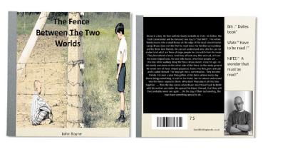
In my opinion the last cover is the one which really fits to the book:)
But i think the standard one is a kind of mysterious for the reader.
But i like it anyway...
But i think the standard one is a kind of mysterious for the reader.
But i like it anyway...
mh (Gast) - 24. Feb, 12:42
The covers are very nice and better then the original one. The impression to me is the important fence and this is very important for the book. The captions of the book indirectly say what the book is about and this might not be interessting for the people, they don't read the book then.